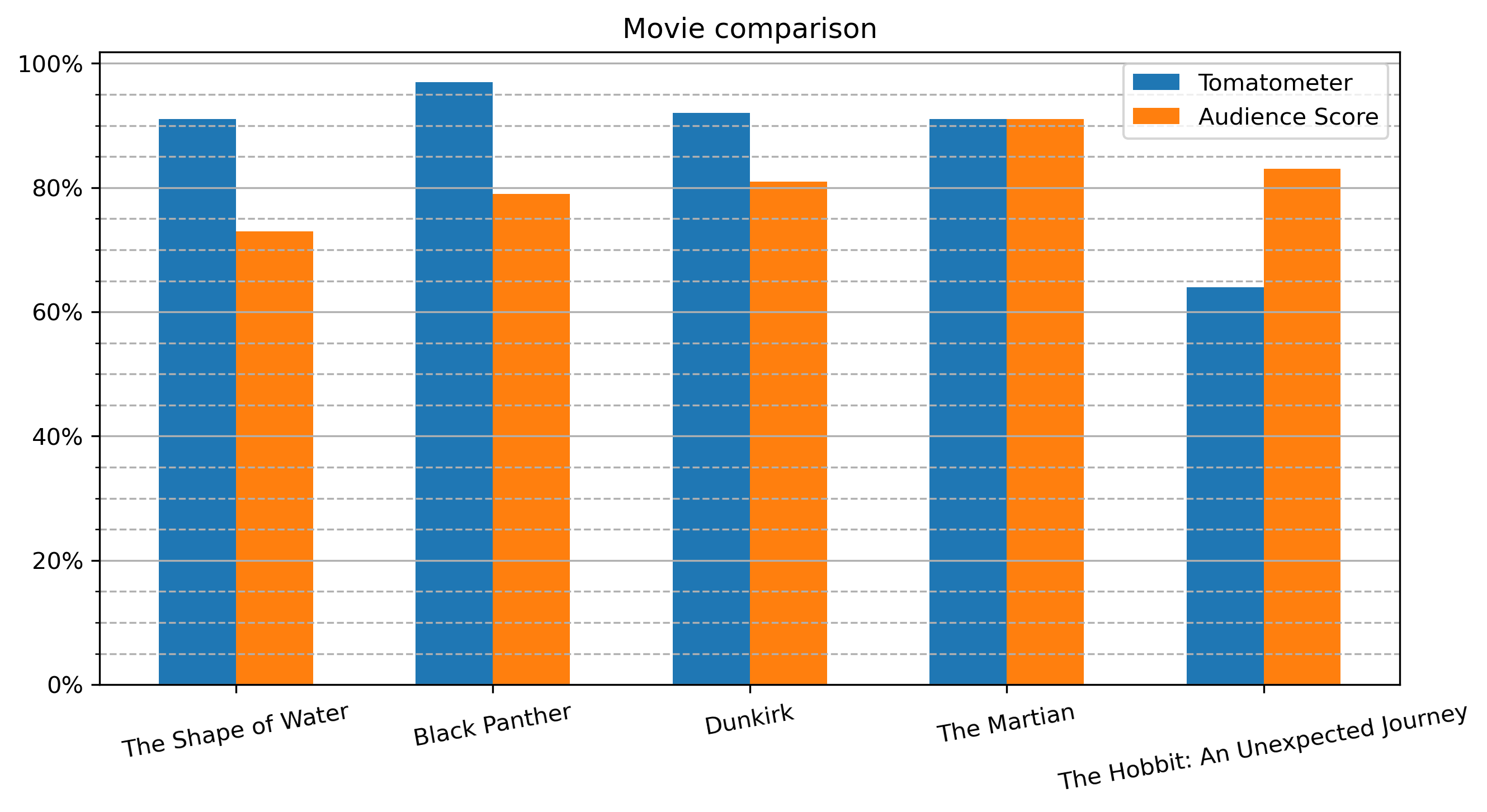
Tomatometer#
Using a bar plot to compare movie scores from Rotten Tomatoes.
Importing libraries and packages#
 1# Mathematical operations and data manipulation
 2import pandas as pd
 3import numpy as np
 4
 5# Plotting
 6import matplotlib.pyplot as plt
 7
 8# Warnings
 9import warnings
10
11warnings.filterwarnings("ignore")
12
13%matplotlib inline
Set paths#
1# Path to datasets directory
2data_path = "./datasets"
3# Path to assets directory (for saving results to)
4assets_path = "./assets"
Loading dataset#
1dataset = pd.read_csv(f"{data_path}/movie_scores.csv")
Exploring dataset#
1# Shape of the dataset
2print("Shape of the dataset: ", dataset.shape)
3# Head
4dataset.head()
Shape of the dataset: (5, 4)
| Unnamed: 0 | MovieTitle | Tomatometer | AudienceScore | |
|---|---|---|---|---|
| 0 | 0 | The Shape of Water | 91 | 73 |
| 1 | 1 | Black Panther | 97 | 79 |
| 2 | 2 | Dunkirk | 92 | 81 |
| 3 | 3 | The Martian | 91 | 91 |
| 4 | 4 | The Hobbit: An Unexpected Journey | 64 | 83 |
Cleaning dataset#
1dataset.drop(dataset.columns[[0]], axis=1, inplace=True)
2dataset.head()
| MovieTitle | Tomatometer | AudienceScore | |
|---|---|---|---|
| 0 | The Shape of Water | 91 | 73 |
| 1 | Black Panther | 97 | 79 |
| 2 | Dunkirk | 92 | 81 |
| 3 | The Martian | 91 | 91 |
| 4 | The Hobbit: An Unexpected Journey | 64 | 83 |
Visualisation#
 1# Create figure
 2plt.figure(figsize=(10, 5), dpi=300)
 3# Create bar plot
 4pos = np.arange(len(dataset["MovieTitle"]))
 5width = 0.3
 6plt.bar(pos - width / 2, dataset["Tomatometer"], width, label="Tomatometer")
 7plt.bar(
 8    pos + width / 2, dataset["AudienceScore"], width, label="Audience Score"
 9)
10# Specify ticks
11plt.xticks(pos, rotation=10)
12plt.yticks(np.arange(0, 101, 20))
13# Get current Axes for setting tick labels and horizontal grid
14ax = plt.gca()
15# Set tick labels
16ax.set_xticklabels(dataset["MovieTitle"])
17ax.set_yticklabels(["0%", "20%", "40%", "60%", "80%", "100%"])
18# Add minor ticks for y-axis in the interval of 5
19ax.set_yticks(np.arange(0, 100, 5), minor=True)
20# Add major horizontal grid with solid lines
21ax.yaxis.grid(which="major")
22# Add minor horizontal grid with dashed lines
23ax.yaxis.grid(which="minor", linestyle="--")
24# Add title
25plt.title("Movie comparison")
26# Add legend
27plt.legend()
28# Show plot
29plt.savefig(
30    f"{assets_path}/movie_scores_matplotlib.png", dpi=300, bbox_inches="tight"
31)
32plt.show()