Smartphone sales#
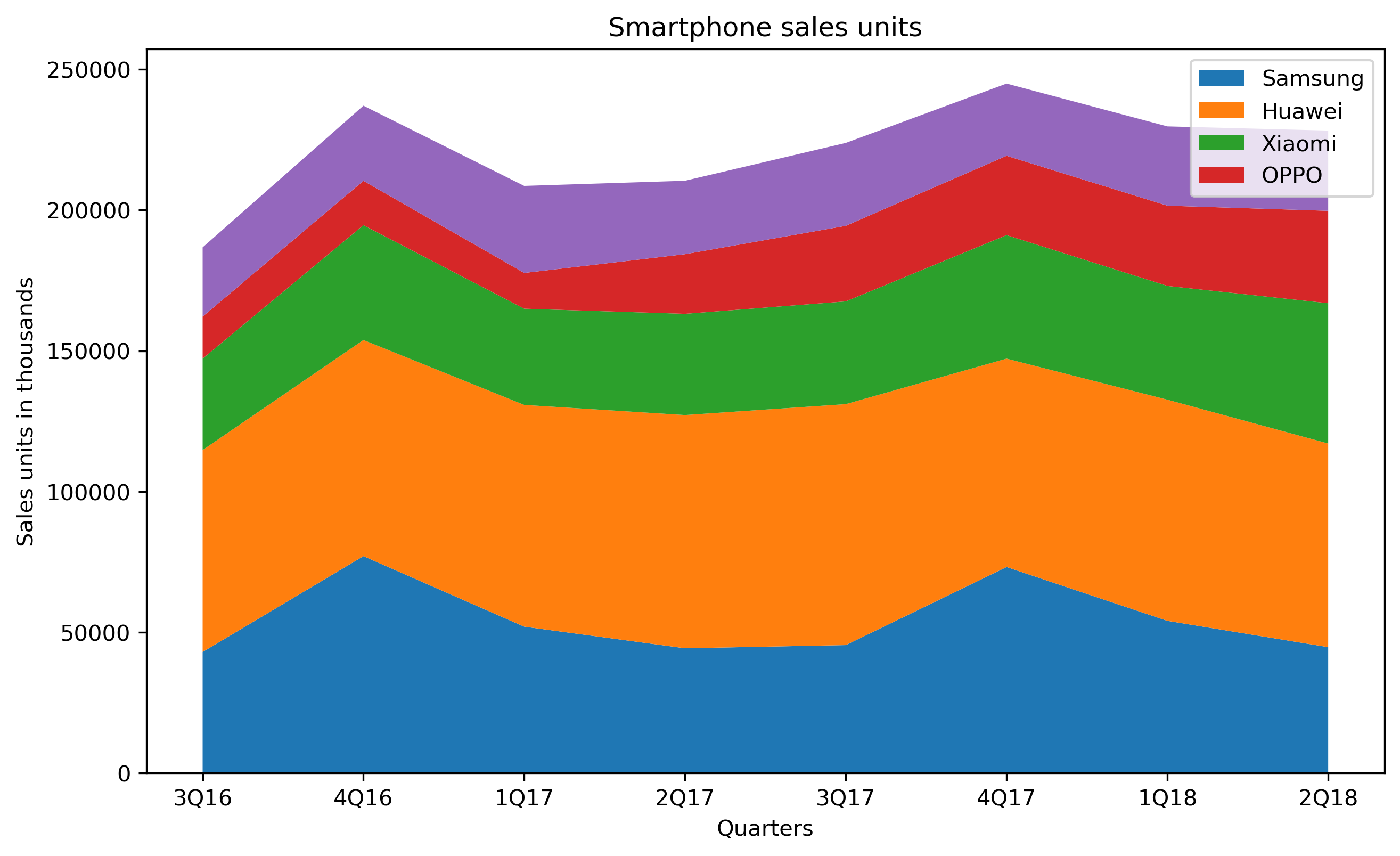
Comparing smartphone sales units using a stacked area chart.
Importing libraries and packages#
 1# Mathematical operations and data manipulation
 2import pandas as pd
 3
 4# Plotting
 5import matplotlib.pyplot as plt
 6
 7# Warnings
 8import warnings
 9
10warnings.filterwarnings("ignore")
11
12%matplotlib inline
Set paths#
1# Path to datasets directory
2data_path = "./datasets"
3# Path to assets directory (for saving results to)
4assets_path = "./assets"
Loading dataset#
1dataset = pd.read_csv(f"{data_path}/smartphone_sales.csv")
Exploring dataset#
1# Shape of the dataset
2print("Shape of the dataset: ", dataset.shape)
3# Head
4dataset
Shape of the dataset: (8, 7)
| Unnamed: 0 | Quarter | Apple | Samsung | Huawei | Xiaomi | OPPO | |
|---|---|---|---|---|---|---|---|
| 0 | 0 | 3Q16 | 43001 | 71734 | 32490 | 14926 | 24591 |
| 1 | 1 | 4Q16 | 77039 | 76783 | 40804 | 15751 | 26705 |
| 2 | 2 | 1Q17 | 51993 | 78776 | 34181 | 12707 | 30922 |
| 3 | 3 | 2Q17 | 44315 | 82855 | 35964 | 21179 | 26093 |
| 4 | 4 | 3Q17 | 45442 | 85605 | 36502 | 26853 | 29449 |
| 5 | 5 | 4Q17 | 73175 | 74027 | 43887 | 28188 | 25660 |
| 6 | 6 | 1Q18 | 54059 | 78565 | 40426 | 28498 | 28173 |
| 7 | 7 | 2Q18 | 44715 | 72336 | 49847 | 32826 | 28511 |
Cleaning dataset#
1dataset.drop(dataset.columns[[0]], axis=1, inplace=True)
2dataset.head()
| Quarter | Apple | Samsung | Huawei | Xiaomi | OPPO | |
|---|---|---|---|---|---|---|
| 0 | 3Q16 | 43001 | 71734 | 32490 | 14926 | 24591 |
| 1 | 4Q16 | 77039 | 76783 | 40804 | 15751 | 26705 |
| 2 | 1Q17 | 51993 | 78776 | 34181 | 12707 | 30922 |
| 3 | 2Q17 | 44315 | 82855 | 35964 | 21179 | 26093 |
| 4 | 3Q17 | 45442 | 85605 | 36502 | 26853 | 29449 |
Visualisation#
 1# Create figure
 2plt.figure(figsize=(10, 6), dpi=300)
 3# Create stacked area chart
 4labels = dataset.columns[2:]
 5plt.stackplot(
 6    "Quarter",
 7    "Apple",
 8    "Samsung",
 9    "Huawei",
10    "Xiaomi",
11    "OPPO",
12    data=dataset,
13    labels=labels,
14)
15# Add legend
16plt.legend()
17# Add labels and title
18plt.xlabel("Quarters")
19plt.ylabel("Sales units in thousands")
20plt.title("Smartphone sales units")
21# Show plot
22plt.show()