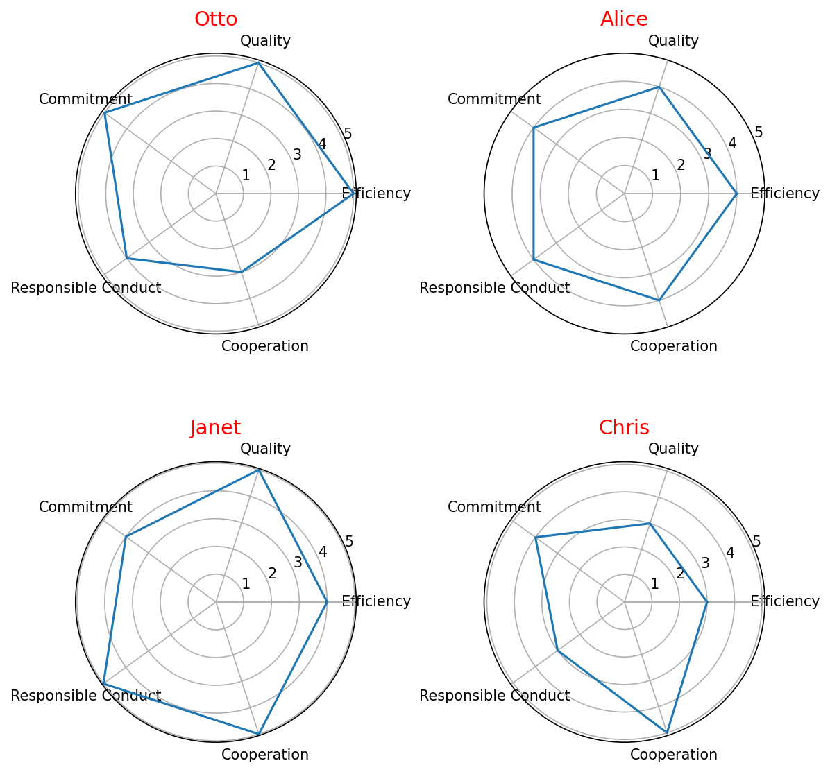
Star performers#
Visualizing the performance of people in a radar chart.
Importing libraries and packages#
 1# Mathematical operations and data manipulation
 2import pandas as pd
 3import numpy as np
 4
 5# Plotting
 6import matplotlib.pyplot as plt
 7
 8# Warnings
 9import warnings
10
11warnings.filterwarnings("ignore")
12
13%matplotlib inline
Set paths#
1# Path to datasets directory
2data_path = "./datasets"
3# Path to assets directory (for saving results to)
4assets_path = "./assets"
Loading dataframe#
 1# Attributes: Efficiency, Quality, Commitment, Responsible Conduct, Cooperation
 2dataset = pd.DataFrame(
 3    {
 4        "Employee": ["Otto", "Alice", "Janet", "Chris"],
 5        "Efficiency": [
 6            5,
 7            4,
 8            4,
 9            3,
10        ],
11        "Quality": [5, 4, 5, 3],
12        "Commitment": [5, 4, 4, 4],
13        "Responsible Conduct": [4, 4, 5, 3],
14        "Cooperation": [3, 4, 5, 5],
15    }
16)
Visualisation#
 1# Create angle values
 2attributes = list(dataset.columns[1:])
 3values = list(dataset.values[:, 1:])
 4employees = list(dataset.values[:, 0])
 5angles = [
 6    n / float(len(attributes)) * 2 * np.pi for n in range(len(attributes))
 7]
 8
 9# Close the plot
10angles += angles[:1]
11values = np.asarray(values)
12values = np.concatenate([values, values[:, 0:1]], axis=1)
13
14# Plotting
15ax = plt.figure(figsize=(8, 8), dpi=150)
16# Create subplots with polar projection
17for i in range(4):
18    ax = plt.subplot(2, 2, i + 1, polar=True)
19    ax.plot(angles, values[i])
20    ax.set_yticks([1, 2, 3, 4, 5])
21    ax.set_xticklabels(attributes)
22    ax.set_xticks(angles)
23    ax.set_title(employees[i], fontsize=14, color="r")
24# Set tight layout so nothing overlaps
25plt.tight_layout()
26# Show plot
27plt.show()