Impact of education#
Get insights on whether the education of people in New York has an influence on their annual salary and weekly working hours.
Importing libraries and packages#
 1# Warnings
 2import warnings
 3
 4# Mathematical operations and data manipulation
 5import pandas as pd
 6import numpy as np
 7
 8# Plotting
 9import matplotlib.pyplot as plt
10import seaborn as sns
11import squarify
12
13sns.set()
14warnings.filterwarnings("ignore")
Set paths#
1# Path to datasets directory
2data_path = "./datasets"
3# Path to assets directory (for saving results to)
4assets_path = "./assets"
Loading dataset#
Dataset created from The American Community Survey (ACS) Public-Use Microdata Samples (PUMS) dataset (one-year estimate from 2017).
1dataset = pd.read_csv(f"{data_path}/age_salary_hours.csv")
Exploring dataset#
1# Shape of the dataset
2print("Shape of the dataset: ", dataset.shape)
3# View
4dataset
Shape of the dataset: (500, 4)
| Age | Annual Salary | Weekly hours | Education | |
|---|---|---|---|---|
| 0 | 72 | 160000.0 | 40.0 | Bachelor's degree or higher |
| 1 | 72 | 100000.0 | 50.0 | Bachelor's degree or higher |
| 2 | 31 | 120000.0 | 40.0 | Bachelor's degree or higher |
| 3 | 28 | 45000.0 | 40.0 | Bachelor's degree or higher |
| 4 | 54 | 85000.0 | 40.0 | Bachelor's degree or higher |
| ... | ... | ... | ... | ... |
| 495 | 27 | 47000.0 | 40.0 | Bachelor's degree or higher |
| 496 | 53 | 132000.0 | 70.0 | Bachelor's degree or higher |
| 497 | 51 | 10100.0 | 20.0 | Bachelor's degree or higher |
| 498 | 32 | 57000.0 | 35.0 | Bachelor's degree or higher |
| 499 | 18 | 18700.0 | 20.0 | Attended college, no degree |
500 rows × 4 columns
Preprocessing#
1# Compute percentages from dataset
2degrees = set(dataset["Education"])
3print(degrees)
{'No diploma', "Associate's degree", "Bachelor's degree or higher", 'High school diploma', 'Attended college, no degree'}
1percentages = []
2for degree in degrees:
3    percentages.append(dataset[dataset["Education"] == degree].shape[0])
4percentages = np.array(percentages)
5percentages = (percentages / percentages.sum()) * 100
6print(percentages)
[ 3.4 10. 47.4 21.4 17.8]
1# Create labels for tree map
2labels = [
3    degree + "\n({0:.1f}%)".format(percentage)
4    for degree, percentage in zip(degrees, percentages)
5]
6print(labels)
['No diploma\n(3.4%)', "Associate's degree\n(10.0%)", "Bachelor's degree or higher\n(47.4%)", 'High school diploma\n(21.4%)', 'Attended college, no degree\n(17.8%)']
1ordered_degrees = sorted(list(degrees))
2ordered_degrees = [
3    ordered_degrees[4],
4    ordered_degrees[3],
5    ordered_degrees[1],
6    ordered_degrees[0],
7    ordered_degrees[2],
8]
9ordered_degrees
['No diploma',
 'High school diploma',
 'Attended college, no degree',
 "Associate's degree",
 "Bachelor's degree or higher"]
1data = dataset.loc[dataset["Age"] < 65]
Visualisations#
 1# Create figure
 2plt.figure(figsize=(9, 6), dpi=200)
 3squarify.plot(
 4    percentages,
 5    label=labels,
 6    color=sns.color_palette("colorblind", len(degrees)),
 7)
 8plt.axis("off")
 9# Add title
10plt.title("Degrees")
11# Show plot
12plt.show()
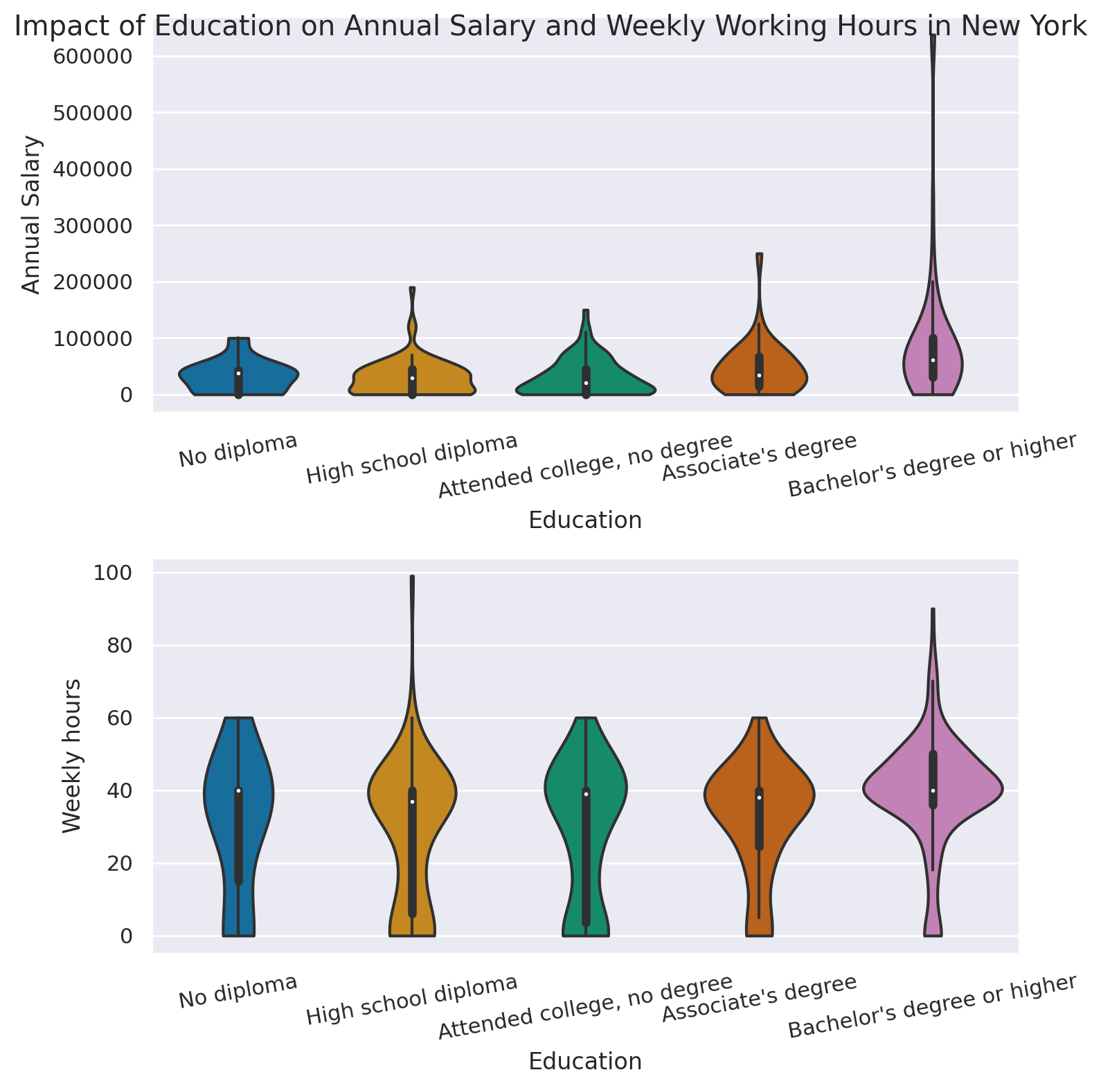
 1# Visualizing two violin plots for the annual salary and weekly working hours
 2# Set color palette to colorblind
 3sns.set_palette("colorblind")
 4# Create subplot with two rows
 5fig, ax = plt.subplots(2, 1, dpi=200, figsize=(8, 8))
 6sns.violinplot(
 7    "Education",
 8    "Annual Salary",
 9    data=data,
10    cut=0,
11    order=ordered_degrees,
12    ax=ax[0],
13)
14ax[0].set_xticklabels(ax[0].get_xticklabels(), rotation=10)
15sns.violinplot(
16    "Education",
17    "Weekly hours",
18    data=data,
19    cut=0,
20    order=ordered_degrees,
21    ax=ax[1],
22)
23ax[1].set_xticklabels(ax[1].get_xticklabels(), rotation=10)
24plt.tight_layout()
25# Add title
26fig.suptitle(
27    "Impact of Education on Annual Salary and Weekly Working Hours in New York"
28)
29# Show figure
30plt.show()