Water usage again#
Creating a tree map using the Squarify and Seaborn libraries to choose where best to save water.
Importing libraries and packages#
 1# Warnings
 2import warnings
 3
 4# Mathematical operations and data manipulation
 5import pandas as pd
 6
 7# Plotting
 8import matplotlib.pyplot as plt
 9import seaborn as sns
10import squarify
11
12sns.set()
13warnings.filterwarnings("ignore")
Set paths#
1# Path to datasets directory
2data_path = "./datasets"
3# Path to assets directory (for saving results to)
4assets_path = "./assets"
Loading dataset#
1dataset = pd.read_csv(f"{data_path}/water_usage.csv", index_col=0)
Exploring dataset#
1# Shape of the dataset
2print("Shape of the dataset: ", dataset.shape)
3# View
4dataset
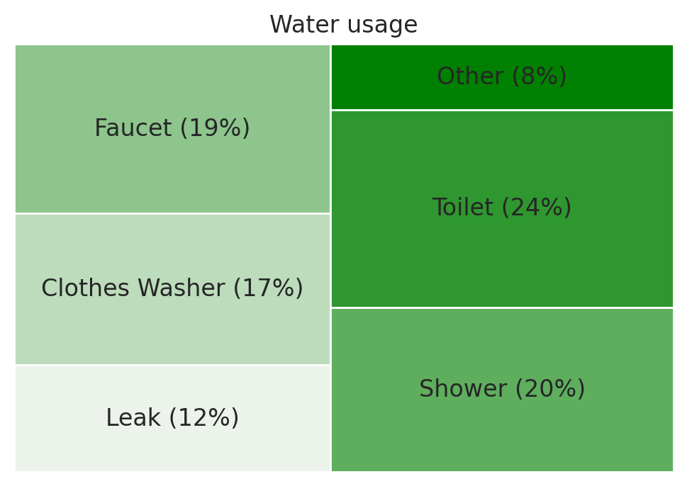
Shape of the dataset: (6, 2)
| Usage | Percentage | |
|---|---|---|
| 0 | Leak | 12 |
| 1 | Clothes Washer | 17 |
| 2 | Faucet | 19 |
| 3 | Shower | 20 |
| 4 | Toilet | 24 |
| 5 | Other | 8 |
Preprocessing#
1# Create a list of labels by accessing each column from the dataset.
2# The astype('str') function casts the fetched data into a type string.
3labels = dataset["Usage"] + " (" + dataset["Percentage"].astype("str") + "%)"
4labels
0              Leak (12%)
1    Clothes Washer (17%)
2            Faucet (19%)
3            Shower (20%)
4            Toilet (24%)
5              Other (8%)
dtype: object
Visualisation#
 1# Creating a tree map visualization using the plot() function of
 2# the squarify library
 3plt.figure(dpi=200)
 4# Create tree map
 5squarify.plot(
 6    sizes=dataset["Percentage"],
 7    label=labels,
 8    color=sns.light_palette("green", dataset.shape[0]),
 9)
10plt.axis("off")
11# Add title
12plt.title("Water usage")
13# Show plot
14plt.show()