Water usage#
Generating a visual representation of water usage using pie charts.
Importing libraries and packages#
 1# Mathematical operations and data manipulation
 2import pandas as pd
 3
 4# Plotting
 5import matplotlib.pyplot as plt
 6
 7# Warnings
 8import warnings
 9
10warnings.filterwarnings("ignore")
11
12%matplotlib inline
Set paths#
1# Path to datasets directory
2data_path = "./datasets"
3# Path to assets directory (for saving results to)
4assets_path = "./assets"
Loading dataset#
1dataset = pd.read_csv(f"{data_path}/water_usage.csv")
Exploring dataset#
1# Shape of the dataset
2print("Shape of the dataset: ", dataset.shape)
3# Head
4dataset
Shape of the dataset: (6, 3)
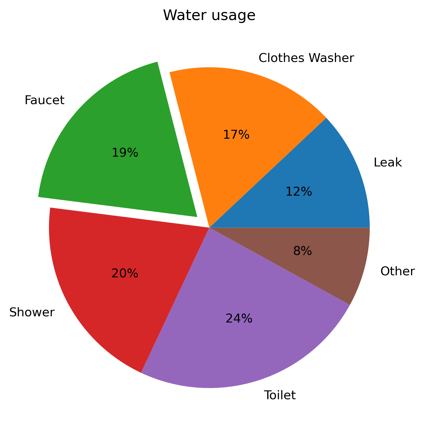
| Unnamed: 0 | Usage | Percentage | |
|---|---|---|---|
| 0 | 0 | Leak | 12 |
| 1 | 1 | Clothes Washer | 17 |
| 2 | 2 | Faucet | 19 |
| 3 | 3 | Shower | 20 |
| 4 | 4 | Toilet | 24 |
| 5 | 5 | Other | 8 |
Cleaning dataset#
1dataset.drop(dataset.columns[[0]], axis=1, inplace=True)
2dataset.head()
| Usage | Percentage | |
|---|---|---|
| 0 | Leak | 12 |
| 1 | Clothes Washer | 17 |
| 2 | Faucet | 19 |
| 3 | Shower | 20 |
| 4 | Toilet | 24 |
Visualisation#
 1# Create figure
 2plt.figure(figsize=(6, 6), dpi=300)
 3# Create pie plot
 4plt.pie(
 5    "Percentage",
 6    explode=(0, 0, 0.1, 0, 0, 0),
 7    labels="Usage",
 8    data=dataset,
 9    autopct="%.0f%%",
10)
11# Add title
12plt.title("Water usage")
13# Show plot
14plt.show()