
Exploratory data analysis#
Importing libraries and packages#
 1# Mathematical operations and data manipulation
 2import numpy as np
 3import pandas as pd
 4
 5# Visualisation
 6import seaborn as sns
 7import matplotlib.pyplot as plt
 8
 9# Warnings
10import warnings
11
12warnings.filterwarnings("ignore")
13
14%matplotlib inline
Set paths#
1# Path to datasets directory
2data_path = "./datasets"
3# Path to assets directory (for saving results to)
4assets_path = "./assets"
Loading dataset#
1# load data
2dataset = pd.read_csv(f"{data_path}/preprocessed_heart.csv")
3dataset.head().T
| 0 | 1 | 2 | 3 | 4 | |
|---|---|---|---|---|---|
| age | 63.0 | 37.0 | 41.0 | 56.0 | 57.0 |
| sex | 1.0 | 1.0 | 0.0 | 1.0 | 0.0 |
| chest_pain | 3.0 | 2.0 | 1.0 | 1.0 | 0.0 |
| rest_bp | 145.0 | 130.0 | 130.0 | 120.0 | 120.0 |
| chol | 233.0 | 250.0 | 204.0 | 236.0 | 354.0 |
| fast_bld_sugar | 1.0 | 0.0 | 0.0 | 0.0 | 0.0 |
| rest_ecg | 0.0 | 1.0 | 0.0 | 1.0 | 1.0 |
| max_hr | 150.0 | 187.0 | 172.0 | 178.0 | 163.0 |
| ex_angina | 0.0 | 0.0 | 0.0 | 0.0 | 1.0 |
| st_depr | 2.3 | 3.5 | 1.4 | 0.8 | 0.6 |
| slope | 0.0 | 0.0 | 2.0 | 2.0 | 2.0 |
| colored_vessels | 0.0 | 0.0 | 0.0 | 0.0 | 0.0 |
| thalassemia | 1.0 | 2.0 | 2.0 | 2.0 | 2.0 |
| target | 1.0 | 1.0 | 1.0 | 1.0 | 1.0 |
Plotting distributions and relationships#
Plotting the Distributions and Relationships Between Specific Features#
 1sns.set(
 2    palette="pastel",
 3    rc={
 4        "figure.figsize": (16, 10),
 5        "axes.titlesize": 18,
 6        "axes.labelsize": 16,
 7        "xtick.labelsize": 14,
 8        "ytick.labelsize": 16,
 9    },
10)
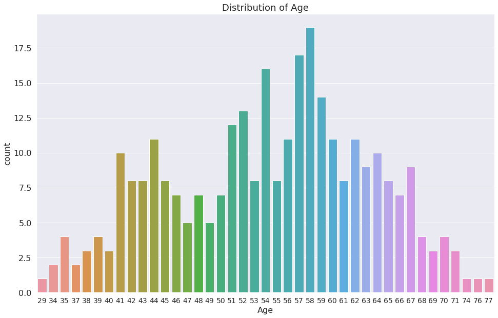
1g = sns.countplot(x="age", data=dataset)
2g.set_title("Distribution of Age")
3plt.xlabel("Age")
Text(0.5, 0, 'Age')
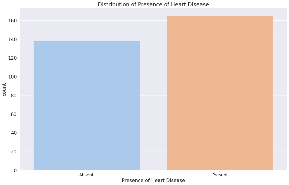
1print(dataset["target"].value_counts())
2print()
3print(dataset["target"].value_counts(normalize=True))
1    165
0    138
Name: target, dtype: int64

1    0.544554
0    0.455446
Name: target, dtype: float64
1a = sns.countplot(x="target", data=dataset)
2a.set_title("Distribution of Presence of Heart Disease")
3a.set_xticklabels(["Absent", "Present"])
4plt.xlabel("Presence of Heart Disease")
5plt.show()
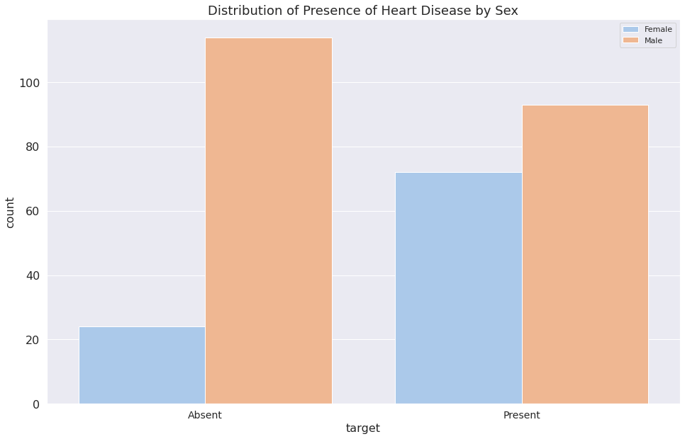
1print(dataset["sex"].value_counts())
2print()
3print(dataset["sex"].value_counts(normalize=True))
1    207
0     96
Name: sex, dtype: int64

1    0.683168
0    0.316832
Name: sex, dtype: float64
1b = sns.countplot(x="target", data=dataset, hue="sex")
2plt.legend(["Female", "Male"])
3b.set_title("Distribution of Presence of Heart Disease by Sex")
4b.set_xticklabels(["Absent", "Present"])
5plt.show()
Plotting Distributions and Relationships between Columns with Respect to the Target Column#
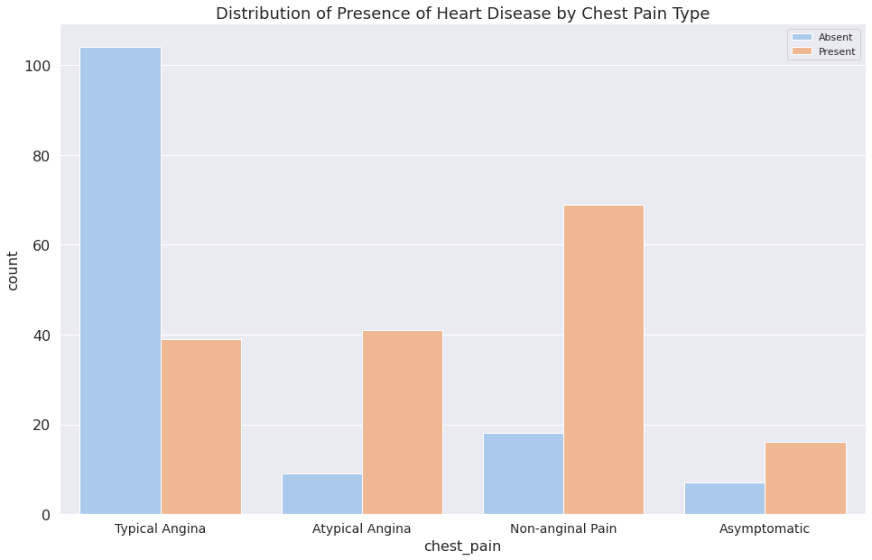
1print(dataset["chest_pain"].value_counts())
2print()
3print(dataset["chest_pain"].value_counts(normalize=True))
0    143
2     87
1     50
3     23
Name: chest_pain, dtype: int64

0    0.471947
2    0.287129
1    0.165017
3    0.075908
Name: chest_pain, dtype: float64
1c = sns.countplot(x="chest_pain", data=dataset, hue="target")
2plt.legend(["Absent", "Present"])
3c.set_title("Distribution of Presence of Heart Disease by Chest Pain Type")
4c.set_xticklabels(
5    ["Typical Angina", "Atypical Angina", "Non-anginal Pain", "Asymptomatic"]
6)
7plt.show()
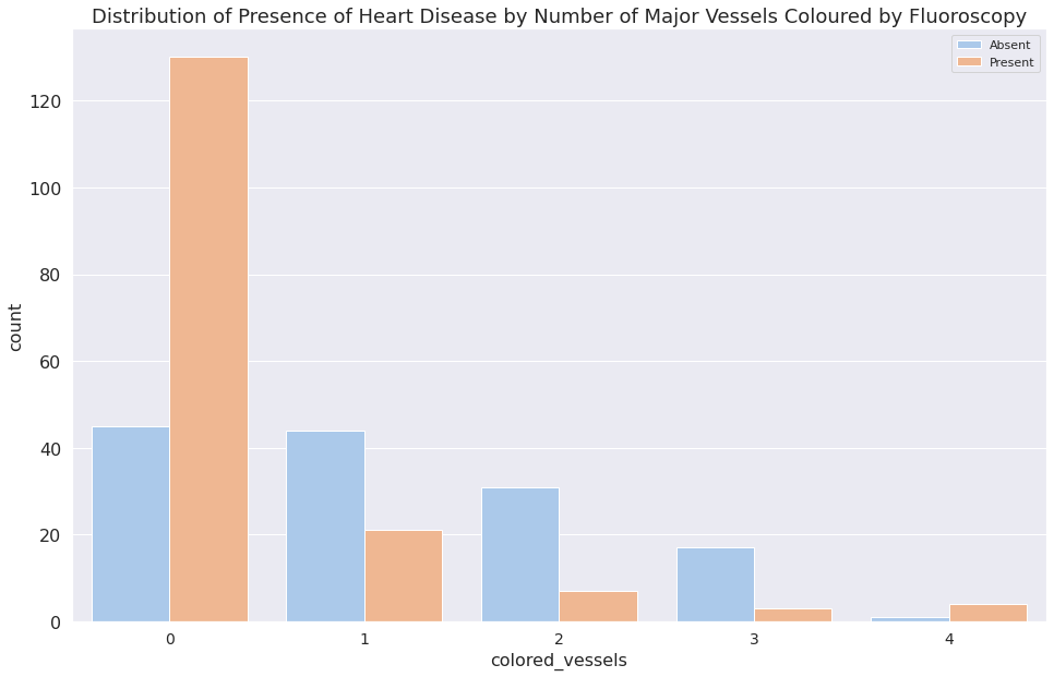
1print(dataset["colored_vessels"].value_counts())
2print()
3print(dataset["colored_vessels"].value_counts(normalize=True))
0    175
1     65
2     38
3     20
4      5
Name: colored_vessels, dtype: int64

0    0.577558
1    0.214521
2    0.125413
3    0.066007
4    0.016502
Name: colored_vessels, dtype: float64
1d = sns.countplot(x="colored_vessels", data=dataset, hue="target")
2plt.legend(["Absent", "Present"])
3d.set_title(
4    "Distribution of Presence of Heart Disease by Number of Major "
5    "Vessels Coloured by Fluoroscopy"
6)
7plt.show()
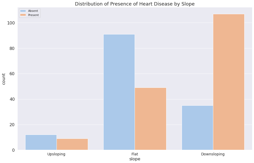
1print(dataset["slope"].value_counts())
2print()
3print(dataset["slope"].value_counts(normalize=True))
2    142
1    140
0     21
Name: slope, dtype: int64

2    0.468647
1    0.462046
0    0.069307
Name: slope, dtype: float64
1f = sns.countplot(x="slope", data=dataset, hue="target")
2plt.legend(["Absent", "Present"])
3f.set_title("Distribution of Presence of Heart Disease by Slope")
4f.set_xticklabels(["Upsloping", "Flat", "Downsloping"])
5plt.show()
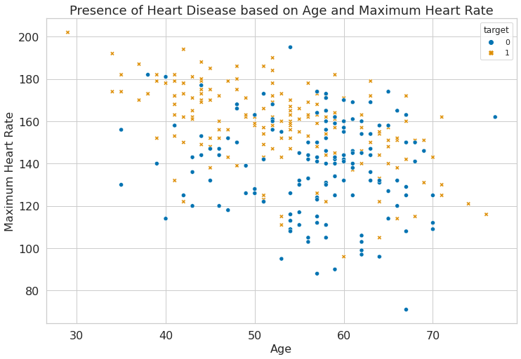
Plotting the Relationship between the Presence of Heart Disease and Maximum Recorded Heart Rate#
 1# Plotting the Relationship between the Presence of Heart Disease and
 2# Maximum Recorded Heart Rate
 3sns.set(
 4    style="whitegrid",
 5    palette="colorblind",
 6    rc={
 7        "figure.figsize": (12, 8),
 8        "axes.titlesize": 18,
 9        "axes.labelsize": 16,
10        "xtick.labelsize": 16,
11        "ytick.labelsize": 16,
12    },
13)
1f = sns.scatterplot(
2    x="age", y="max_hr", hue="target", style="target", data=dataset
3)
4f.set_title("Presence of Heart Disease based on Age and Maximum Heart Rate")
5plt.xlabel("Age")
6plt.ylabel("Maximum Heart Rate")
Text(0, 0.5, 'Maximum Heart Rate')
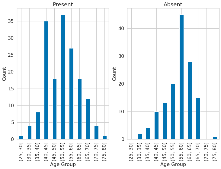
 1dataset["age_category"] = pd.cut(dataset.age, bins=list(np.arange(25, 85, 5)))
 2
 3plt.subplot(121)
 4dataset[dataset.target == 1].groupby("age_category")["age"].count().plot(
 5    kind="bar"
 6)
 7plt.title("Present")
 8plt.xlabel("Age Group")
 9plt.ylabel("Count")
10plt.subplot(122)
11dataset[dataset.target == 0].groupby("age_category")["age"].count().plot(
12    kind="bar"
13)
14plt.title("Absent")
15plt.xlabel("Age Group")
16plt.ylabel("Count")
Text(0, 0.5, 'Count')
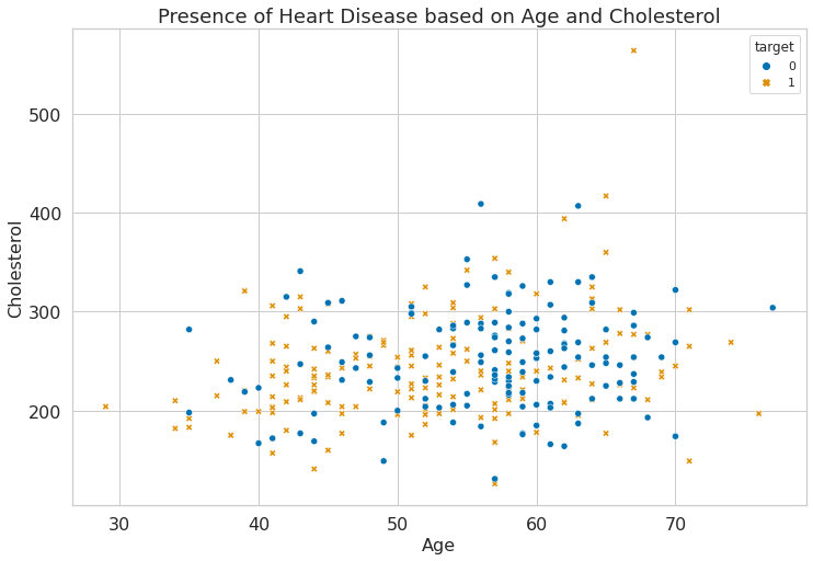
Plotting the Relationship between the Presence of Heart Disease and the Cholesterol Column#
1g = sns.scatterplot(
2    x="age", y="chol", hue="target", style="target", data=dataset
3)
4g.set_title("Presence of Heart Disease based on Age and Cholesterol")
5plt.xlabel("Age")
6plt.ylabel("Cholesterol")
Text(0, 0.5, 'Cholesterol')
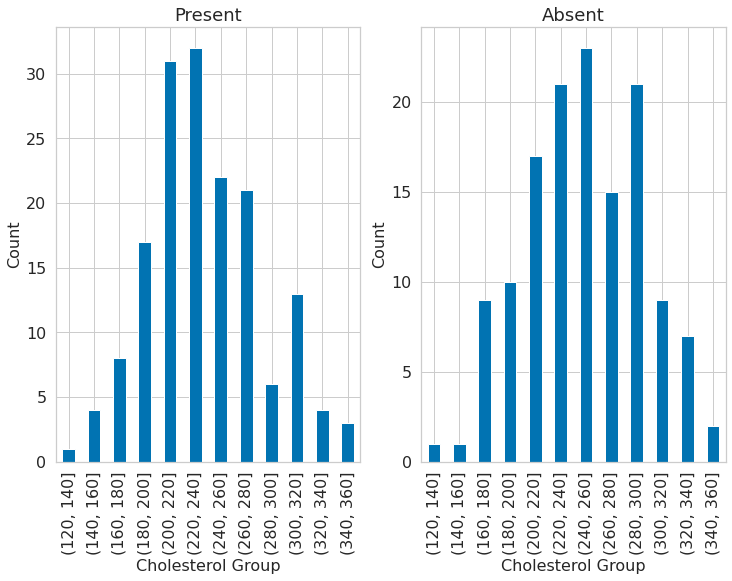
 1dataset["chol_cat"] = pd.cut(dataset.chol, bins=list(np.arange(120, 380, 20)))
 2dataset["chol_cat"] = pd.cut(dataset.chol, bins=list(np.arange(120, 380, 20)))
 3
 4plt.subplot(121)
 5dataset[dataset.target == 1].groupby("chol_cat")["chol"].count().plot(
 6    kind="bar"
 7)
 8plt.title("Present")
 9plt.xlabel("Cholesterol Group")
10plt.ylabel("Count")
11
12plt.subplot(122)
13dataset[dataset.target == 0].groupby("chol_cat")["chol"].count().plot(
14    kind="bar"
15)
16plt.title("Absent")
17plt.xlabel("Cholesterol Group")
18plt.ylabel("Count")
Text(0, 0.5, 'Count')